How To Choose The Perfect Interior Paint Color
How To Pick The Right Paint Color
# How to Choose the Perfect Interior Paint Colors
Picking the right paint colors can transform your home. Here's what you need to know:
- Colors affect mood: Blue and green calm, red and orange energize
- Use the 60-30-10 rule: 60% main color, 30% secondary, 10% accent
- Test before buying: Paint large swatches on walls, check in different lights
- Match paint to existing elements: Consider furniture, floors, and trim
- Watch for undertones: Neutrals can have hidden hues
- Create flow: Use similar colors throughout your home
- Take your time: Don't rush the decision
Key steps:
1. Consider room purpose
2. Test colors in your space
3. Balance with existing elements
4. Check for undertones
5. Create a cohesive palette
| Color | Mood | Best For |
| --- | --- | --- |
| Blue/Green | Calm | Bedrooms, offices |
| Red/Orange | Energetic | Kitchens, living rooms |
| Neutral | Versatile | Any room |
Remember: Trust your instincts. It's your home - choose colors that make you happy.
## Related video from YouTube
::: @iframe https://www.youtube-nocookie.com/embed/HDZL-xLg3FY
:::
## How Colors Affect Your Mood
Walk into a room and feel instantly calm or energized? That's color at work. Paint colors don't just make your space look good - they can change how you feel and act.
### What Each Color Makes You Feel
Colors can trigger different emotions and physical responses:
| Color | Emotional Effect | Physical Effect |
| --- | --- | --- |
| Red | Passion, excitement | Ups heart rate and blood pressure |
| Blue | Calmness, relaxation | Lowers heart rate and blood pressure |
| Yellow | Happiness, energy | Can strain eyes in large amounts |
| Green | Tranquility, nature | Reduces stress, aids healing |
| Purple | Creativity, luxury | Calming or dramatic (depends on shade) |
| Orange | Enthusiasm, warmth | Boosts appetite and chat |
It's not just about picking your favorite color. Shade and intensity matter too. Soft yellow? Cheerful. Bright yellow? Might make you anxious.
### Best Colors for Each Room
Pick the right color to boost each room's purpose:
Bedrooms? Go for calming blues or greens. They help you relax and sleep better.
Kitchen? Warm colors like red or orange. They make you hungry and chatty.
Home office? Blues and greens. They help you focus and get stuff done.
Living room? Earth tones or soft greens. They make the space feel welcoming and chill.
> "Color affects people in different ways - there are general ways a shade brings about a mood." - Color Psychology Expert
### Setting the Right Mood
Want the perfect vibe in your home? Here's how:
1\. **Think about the room's job**: What do you want to feel when you're in there?
2\. **Try before you buy**: Use big paint samples. See how they look morning, noon, and night.
3\. **Balance it out**: Use the 60-30-10 rule. 60% main color, 30% second color, 10% accent color.
But here's the thing: your personal taste matters. Color psychology gives you guidelines, but trust your gut too.
Nicole Gibbons from Clare Paint says, "Warm and vibrant yellows and pinks can create a happy, uplifting feeling in your space." But if those colors stress you out? Go with what feels right to you.
## Where to Start with Colors
Picking paint colors doesn't have to be a headache. Start with what you've got and go from there. Here's how to choose colors that play nice with your stuff and your space.
### Match Colors to Your Furniture
Your couch and chairs are a great jumping-off point. Here's the deal:
- Check out the subtle colors in your furniture fabric or wood. They'll point you in the right direction for walls.
- If your furniture's plain Jane, go bold on the walls. Got loud furniture? Tone it down with softer wall colors.
- Stick to colors that get along with your furniture's overall vibe.
**Quick Tip**: Grab some free paint swatches and hold them up to your furniture. See how they look in different light.
### Work with What's Already There
Some stuff in your house isn't going anywhere. Here's how to deal:
| What You've Got | What to Do |
| --- | --- |
| Wood floors | Pick wall colors that make the wood look good |
| Tile | Go with colors that either match or contrast the tile |
| Cabinets | Balance it out (cool walls for warm cabinets, etc.) |
Don't forget: Your floor sets the tone. Dark floors plus dark walls? That's a recipe for a cave.
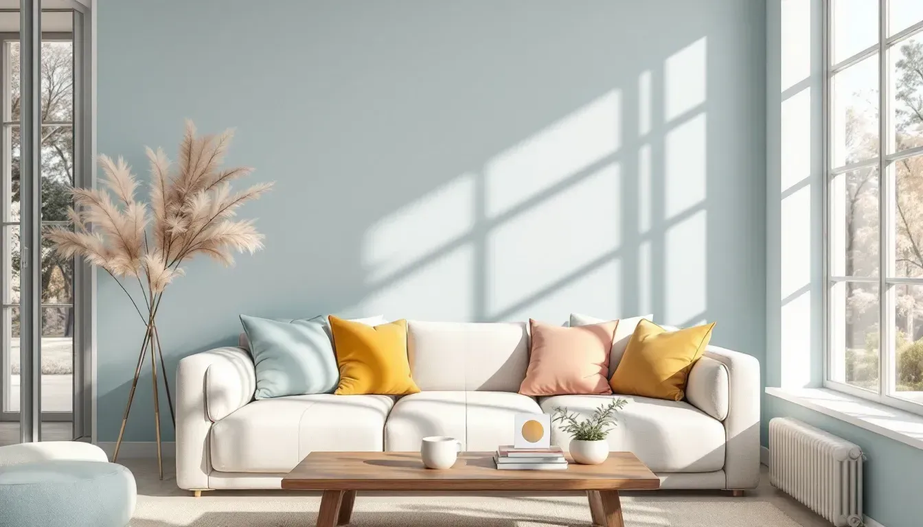
### The 60-30-10 Rule
This trick keeps your colors in check:
- 60% main color (usually walls)
- 30% secondary color (big furniture or an accent wall)
- 10% accent color (small stuff like pillows)
Here's what it might look like:
| How Much | Where | Example |
| --- | --- | --- |
| 60% | Walls | Light gray |
| 30% | Couch and drapes | Deep green |
| 10% | Pillows and lamps | Bright yellow |
This way, your room looks put together without being boring.
### Getting Pro Help
Sometimes, calling in the big guns saves you time and money. Color pros know their stuff:
- They get how colors change in different light
- They can suggest color combos you'd never think of
- They know what's hot now and what always looks good
> "The colors around us can change how we feel more than we think."
That's why getting your colors right matters. It's not just about looking good - it's about feeling good in your space.
## Types of Color Combinations
Let's explore some effective ways to mix colors that'll make your space stand out.
### Using One Color in Different Shades
Want a cohesive look? Go monochromatic:
- Pick a color you love
- Use various shades throughout the room
- Add textures for interest
Designer Leanne Ford used this trick in a recent project:
> "Ford's foyer crown molding and wall paneling are painted a slightly different hue than the adjacent living space - cozying it up and making each room feel larger."
This approach works great in small spaces, creating a sense of size and unity.
### Mixing Opposite Colors
For a bold look, pair colors from opposite sides of the color wheel:
| Primary Color | Opposite Color | Effect |
| --- | --- | --- |
| Red | Green | Energetic and natural |
| Blue | Orange | Calm and warm |
| Yellow | Purple | Cheerful and regal |
**Pro tip**: Use darker or less saturated versions to avoid eye strain. Think navy blue with soft coral instead of bright blue and orange.
### Working with Neutral Colors
Neutrals are versatile and play well with most colors and styles. Here's a quick guide:
1\. Choose a main neutral (white, beige, gray)
2\. Add color pops with accessories
3\. Mix in different materials for depth
Designer David Samuel Ko explains:
> "We used darker-shade woods, warm brass, and textiles to create a warm, inviting space that wasn't too tonal or boring."
### Try Before You Buy
Test your color scheme before committing:
1\. Get large paint samples or swatches
2\. Place them on your walls
3\. Check them at different times of day
4\. See how they look with your furniture and decor
Colors can change based on your room's lighting. What looks great in the store might not work at home.
Designer Amanda Nisbet advises:
> "Trust your instincts. Don't be afraid to play with colors in unexpected ways. If you're naturally drawn to a particular combination, there's a reason why!"
###### sbb-itb-b1dde6f
## How to Test Paint Colors
Picking paint colors isn't just about loving them in the store. You need to see how they look in your space. Here's how to test paint colors like a pro:
### Use Big Paint Samples
Tiny paint chips? Not gonna cut it. You need to go big to really see how a color will look on your walls.
Why? Small swatches can trick your eye. The background color messes with how you see the paint.
Instead:
1. Get sample-sized jars of your top color picks.
2. Paint large swatches (at least 1 foot square) on poster board or directly on your walls.
3. If painting on walls, put white paper around three sides of each sample. This helps you judge the new color without the old one interfering.
> "You're talking about a tiny little representation of the color - it's too small to allow someone to be able to envision what it would look like at a larger scale." - Nicole Gibbons, Founder of Clare Paint
Pro tip: Try [Samplize](https://samplize.com/?srsltid=AfmBOoo5AYqxRiEZOouuBwqte4UeewGbIPnOaa9NVtb15C6-w2RSFEvq). They sell big peel-and-stick paint samples. Way easier than messing with paint pots.
### Check Colors in Different Light
Light changes EVERYTHING when it comes to paint. Here's what to look for:
| Light Source | What to Check |
| --- | --- |
| Natural light | How color looks by windows vs. interior walls |
| Overhead lights | Any weird shadows or dull spots |
| Lamps | Warm vs. cool tones at night |
Don't forget to check your paint samples next to trim, countertops, and furniture. You want everything to play nice together.
### Look at Different Times of Day
Paint colors are sneaky shape-shifters. That perfect gray in the morning might look totally different by dinner time.
Quick test schedule:
- Morning: How does it look in soft, cool light?
- Midday: Check it in bright, direct sunlight
- Evening: See how it changes in warm, fading light
- Night: How does it look under artificial light?
Live with your samples for at least 2 days. This gives you time to see all the color's moods.
### Room Direction Matters
The direction your room faces can totally change how paint looks. Here's the breakdown:
| Room Direction | Light Effect | Color Tips |
| --- | --- | --- |
| North-facing | Cool, bluish light | Warm colors look muted, cool colors pop |
| South-facing | Warm, golden light | Most colors look good |
| East-facing | Bright morning, cool afternoon | Reds and yellows shine in the AM |
| West-facing | Cool morning, warm evening | Darker colors can look intense later in the day |
Remember: Colors can look different on various sides of your house. Test in the actual room you're painting for best results.
## Making Colors Work Together
Want your home's colors to flow smoothly? It's not just about picking pretty shades. It's about making them play nice together. Here's how to create a color scheme that works throughout your home.
### Colors in Connected Rooms
Open floor plans are popular, but they can be tricky to paint. Here's how to nail it:
Pick a main color as your base. This will be your go-to for most walls. Then, stick to shades within the same color family for a smooth transition. For example:
| Room | Color | Shade |
| --- | --- | --- |
| Living Room | Blue | Gray-blue |
| Kitchen | Blue | Pure blue |
| Foyer | Blue | Navy |
Don't forget about accents. If your living room has blue and green accents, try blue and yellow in the dining room. It keeps things fresh but connected.
> Designer Philippa Radon says, "I call it a golden thread, and that thread weaves through every space. If blue walls dominate one room, repeat blue in small ways in neighboring rooms, like a sky blue ceiling or a navy sofa."
### Smooth Color Changes
Want to avoid jarring transitions? Try these tricks:
Paint a strip of the new color where rooms meet. It's like a visual handshake between spaces. Or use an ombre effect to blend colors smoothly. Another option? Paint all your trim the same color. It ties rooms together even if the walls are different.
### Keep Colors Balanced
Balance is key to a harmonious home. Here's how to do it:
Stick to 3-5 colors max for your whole house. Use the 60-30-10 rule:
| Percentage | Color Use |
| --- | --- |
| 60% | Dominant color (walls) |
| 30% | Secondary color (furniture) |
| 10% | Accent color (accessories) |
Don't forget about light. North-facing rooms? Warm colors might look muted. South-facing? Most colors shine.
Lastly, use rugs, art, or curtains that include colors from both rooms to create a visual link. This ties everything together and makes your home feel cohesive.
## Common Paint Color Mistakes
Picking the right paint color isn't just about choosing your favorite shade. Even pros can mess up. Let's look at some common mistakes and how to dodge them.
### Hidden Color Tones
Ever picked a color and thought, "This isn't what I wanted!" on your walls? That's because paint colors have sneaky undertones.
| Color | Possible Undertones |
| --- | --- |
| Gray | Purple, blue, green |
| White | Yellow, pink, blue |
| Beige | Green, pink, orange |
Michelle Bray from Five Star Painting says, "Yellow and red can be tricky. They might look totally different on different walls or rooms."
To avoid this:
- Get big paint samples
- Look at them in different spots
- Check them throughout the day
### Light Changes Everything
Light can make or break your paint color. That perfect gray in the store? It might look like mud in your living room.
Adrienne Breaux, House Tour Director, puts it this way: "Light is everything for color. It can make a color pop... or turn a gray purple-ish or a white dingy."
**Pro tip**: Paint big poster boards with your colors. Move them around the room all day to see how they change.
### Don't Rush Your Color Choice
Picking a color too fast? You might regret it. Paint isn't just about looks – it's about how it makes you feel in your space.
Michelle Bray warns, "Rushing can lead to buying furniture that doesn't match, and you end up with a mix of stuff you don't even like."
Take your time. Live with paint samples for a few days before you decide.
### How to Avoid Mistakes
1\. **Get a pro's help**
Michelle Bray suggests, "Work with a color expert who can come to your place and help you figure it out." They can spot issues you might miss.
2\. **Test, test, test**
Natalie Ebel from Backdrop says, "Light changes all day. Look at your sample in the morning, afternoon, and evening. Move it to different walls too."
3\. **Think big picture**
Don't pick paint by itself. Think about your furniture, floors, and overall style. Paint has the most options and is cheapest, so pick it last.
4\. **Trust yourself**
Natalie Ebel reminds us, "The biggest mistake? Not trusting your own style." Expert advice is great, but your home should feel like you.
## Wrap-Up
Picking the right paint colors can make or break your living space. Here's what you need to know:
**Room purpose matters.** Colors affect mood. Blue and green bedrooms? Relaxing. Red and orange kitchens? They'll make you hungry and chatty. Blue or green home offices? They help you focus.
**Balance is key.** Use the 60-30-10 rule:
- 60% main color (walls)
- 30% secondary color (furniture)
- 10% accent color (accessories)
**Test before you commit.** Paint big swatches (4x4 feet minimum) on your walls. Check them out at different times of day. You'll see how the color plays with your lighting and stuff.
**Work with what you've got.** Match paint to your furniture and floors. It's way easier than the other way around.
**Watch out for sneaky undertones.** Neutrals can trick you:
- Gray might have purple, blue, or green hints
- White could lean yellow, pink, or blue
- Beige might hide green, pink, or orange
**Create a flow.** Use similar colors throughout your home. Designer Margaret Naeve Parker says:
> "Using the same color on all the trim and doors is an architectural element that remains consistent, unifying the entire home's aesthetic."
**Don't rush it.** Take your time. See how colors change throughout the day and with different lights.
**Trust your gut.** Sure, expert advice is great. But it's your home. If a color feels right to you, go for it.
## FAQs
### How do you know what colors go together in a room?
Picking colors that work well together can be tricky. But don't worry, there are some simple tricks you can use:
1. **Color wheel**: Look at colors opposite each other. Blue and orange? They create energy and balance.
2. **Stick to a theme**: Want a cohesive look? Choose colors from the same family.
3. **60-30-10 rule**: Use 60% dominant color, 30% secondary, and 10% accent.
4. **Room purpose**: Think about what the room is for. Calm colors for bedrooms, energetic ones for living spaces.
> "Blue and orange, directly opposite on the color wheel, add energy to any room. These complementary colors balance each other visually." - Ed Edrosa, Senior Product Manager for Behr
Pro tip: Test your colors in the actual room. Paint big swatches on the walls. Check them out at different times of day. See how they play with the room's lighting.
### Do paint colors affect mood?
You bet they do! The colors on your walls can change how you feel in a space. Here's a quick rundown:
| Color Group | Mood Effect | Where to Use |
| --- | --- | --- |
| Warm (red, orange, yellow) | Energizing | Social spaces, kitchens |
| Cool (blue, green) | Calming | Bedrooms, offices |
| Neutral (beige, gray) | Balanced | Anywhere, great base color |
> "Colors stimulate different parts of the brain and affect mood. Warm colors like red, orange and yellow tend to be more stimulating. Cool colors like blue and green can feel more peaceful." - Becca Otis, Office Manager at Amsberry's Painting
When picking colors, think about what you want the room to feel like. Want a chill bedroom? Go for a soft blue. Need a creative boost in your home office? Try a bright yellow.